The Renovation Plan


2 months ago, almost exactly, I bought my first "flip".  The term "flip" brings to mind a quick renovation in order to churn up some cash, but thats not my goal with this house. Sure, making money on it (or at least breaking even!), is part of the plan, but I am interested in taking the bones of an old, well-made house and making it someone's dream home. For the average buyer I represent, doing extensive renovations isn't in their budget. So my goal is to not only create a home for someone, ready-to-go, but to bring an old home back to life and pay tribute to the original craftmanship. 

But enough. Off the soapbox and onto the house! 

Its approximately 100 years old, probably a bit older than that. It's around 2000 sq ft, and originally housed 4 -5 bedrooms and 2 full baths. It had "servants' stairs" off the kitchen, rosettes on every doorframe and extremely tall ceilings (over 9 ft) 

But when I bought it, it more or less looked like this.. 


(That odd little door went to an odd little roof deck, which the roof was definitely not designed to hold...) 

Most of the walls and trim had been gutted by the previous owner/flipper. While a lot was obviously lost, some original charm remained. 

(Ok, so bamboo plexiglass isn't charming, but the original door, once the glass is replaced, will be!) 


The previous owner had already roughed in a master suite with closets and bath. While I decided to rework the floorplan a bit, allowing for a tub and double sink addition, the "servants' stairs" were going to have to go. While I hate removing original details, in order to create the master suite, they were going to be covered. 

So the first floor plan was getting reworked, allowing for more use of space. 


The new plan allows for the kitchen to be opened to the living and dining areas. 


The finished thing should look a bit more like this... 


(not this modern, but you get a feel for the space) 

And for a taste of the future kitchen layout and decor...


The master suite started with a much smaller bath under the previous flipper's plan. It allowed for a dressing area with two smaller closets and small nook, but the bathroom itself only allowed for a 24-30" vanity and shower stall. 


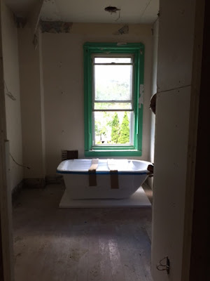
We made the bedroom itself a bit smaller but opened up the bath, for a more luxurious layout, adding a clawfoot tub, double sink and extending the closets (one standard size and one walk-in). 


New tub below, waiting to get roughed in. 


The master suite will be a chance to really bring back the original elements with a clawfoot tub and beadboard walls. 

The other two bathrooms, which were original to the home, will similarly try to be both era-appropriate and comfortably modern. 


The other bedroom and living spaces will keep and match as much original trim and details as possible (like those wonderful transoms in the 3rd floor bedrooms!).

A lot of progress has been made in plumbing, electrical, HVAC, masonry, roofing and siding. Updates and pictures coming soon! 


Comments

Popular posts from this blog

Accessibility in Good Design

 I've been impressed lately with some of amount of accessible design features I've seen around as of late. By "accessible design", I mean home decor, renovations and design that is accessible to those with a physical impairment or disability.  First I noticed that back in March, Better Homes and Gardens did a great feature on a home designed with a wheelchaired child in mind.  Yes, it was a rancher and mid-century modern in design so it leant itself to move open-flow and clean line design. But even if this isn't your style, there were some great ideas here!  Check it out here  Then I saw Southern Living did a great home build with "adaptive design" in mind. This was a great feature because it reviewed new construction and slight changes in thinking to make just a welcoming, easy access home for all guests.  As noted in the article,  " If you’re going to be a good host, particularly from the Southern point of view, where we’re all about hospitality,

Those pesky extra rooms...

Ok, its a pretty first-world problem, but there plenty of people who live in suburbia (or even in the city!) who have a room or two that they just don't use. Often, its a formal dining room or extra bedroom, but if you are the owner of such a room, you may wonder why you are paying for so much unused space! Today, I'm walking through some of the best uses of dead space in your house and how to make it you new favorite room! The Formal Dining Room This is the most commonly "complained-about" space in the suburban home. While we still like to entertain, a lot of people aren't crazy about a whole, extra, (often large) room thats only used on a handful of occasions throughout the year. Unless you have family dinners there, this is likely a space that you are taxed on & heating that sits vacant 350 days of the year. One of my personal favorite ways to reuse this room is to use it as a craft/workspace. The room can keep a large dining table and chairs that

All About Green!

 Bright white and moody colors will likely never go out of style but we are seeing more and more mid-tones come back on trend (last time mid-tones were cool were probably around 2000 when Pottery Barn was THE word).  One of the ones I am seeing most often is a gray-green. Its a friendly color that pairs well with more modern tones (think the grays, blacks and whites we have been seeing) but warms nicely with wood tones and natural materials.  Apparently SW sees this too as their color of the year (and the month of Jan) is Evergreen Fog.  Want to see some of the best ways to use it?  Loving these cabinets in green!  Again, working well hear with both bronze/black and earth tones  Love this more traditional-eclectic look. Looks much more saturated in a dark space!  But also a great pairing for a mid-century boho look  Great combo color - bold but not overly so. Here looking more truly green against the dark blue Whatever your style, this is a very versatile way of adding some color to